
Journey Kids
SERVICES
Brand Strategy & Design
Environmental Design
Custom Fixtures & Signage
After making finish selections and designing the main level of Journey Church, our next objective was to move into the kids space. With a name like Journey we wanted to lean into a navigation inspired theme, while keeping the style abstract and modern for longevity. Internally, we let the concept of the journey of childhood inform the patterns and elements designed for this space. An oversized path loops throughout the lobby, preschool and elementary areas to visually guide you through each space. We incorporated many of the same finishes used in the primary church lobby — concrete floors, open ceilings, globe lighting, wood look baffles, and nuted navy and white base colors to help this kids space feel like a cohesive extension of the rest of the building.
For the Journey Kids logo, we again played with the theme of navigation and ultimately landed on the image of a compass.
The basic format of the icon mimics the Journey Church logo - we even tilted the compass needle at the same angle of the ‘J’ to give it a look of whimsy and playfulness.
The client wanted the logo to have lots of color and personality, so we chose colors to compliment the muted navy and paired it with a chunky script typeface to keep the look youthful and fun.


In the lobby area, we had custom wall-mounted check in stations fabricated to hide cables and power supply while meeting ADA standards. The custom New Family Check-In desk features varied height counters, interior storage and locking casters allowing it to be moved as needed. Wood-look overhead baffles were installed with hanging light fixtures and signage to stand out against the open ceiling while also providing acoustic benefits.


In the preshool area, we combined mural painted elements, vinyl decals and dimensional pieces for a colorful and playful approach to navigation. Some of the patterns - like the letters and numbers - were inspired by milestones of early childhood.
The stage backdrop was designed to emulate the view from a treehouse using layers of branches and overhead leaves to make this space feel larger than life.

We incorporated tiny doors to be installed as child entrances into three of the classrooms. And all classroom doors feature easily interchangeable signage overhead for clear visibility from the entrance to the space.
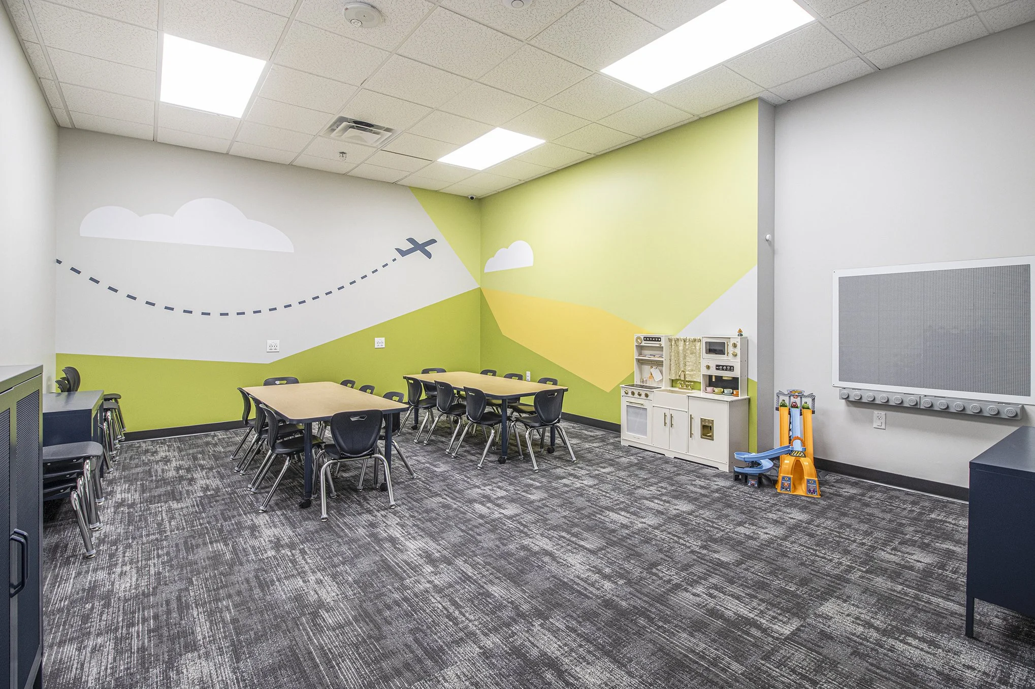
Inside each classroom, we executed color-blocking in monochromatic schemes and layered vinyl graphic decals on top - shapes and imagery in preschool rooms and bible verses in elementary rooms.


The elementary hallway - separate from the preschool area - utilizes the same color palette but in darker, more vibrant values to create a slightly older feel. We continued the looping path from the lobby to allow for a natural break between patterns. These breaks offer a visual balance by creating smaller areas of emphasis for more detailed design work.


We were also asked to design the stage backdrop in the elementary large group programming room. In lieu of a literal theme (like we did in the preschool area), we leaned into the abstract, organic shapes present throughout the elementary hallway. To give it a bit more flare, we added dimensional layers like the oversized squiggle mounted to the ceiling and a chunky, back-lit logo icon.