Eyes2See
SERVICES
Brand Strategy & Design
Website Design
Print Design
After completing their real estate brand and website, Lange & Jamie Patrick approached us to create a brand suite for their nonprofit called Eyes2See. We were immediately drawn to their mission of ‘Equipping people to see every person as worthy of dignity, value and honor.’
Our goal was to communicate a feeling of inclusivity, approachability and curiosity for both the target audience and the communities its resources serve.

The magnifying glass is a symbol of clarity and curiosity - allowing objects to be examined more closely. The shape of the glass acts like a human eye, allowing rays of light to pass through and bend accordingly.
For Eyes2See, we wanted to treat the letter '2' in a way that encouraged learning, clarity and confidence in looking at something through a different lens.

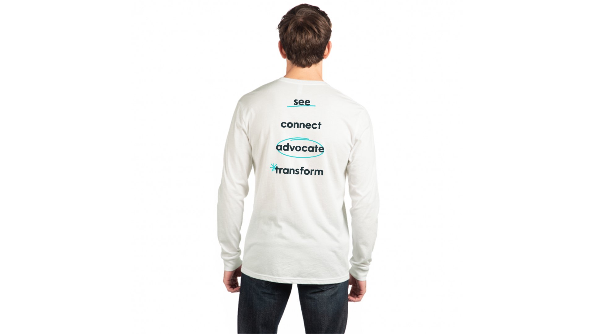
We added optional hand-drawn doodles to the brand kit to emphasize the human element that is vital to the mission and values of the non-profit. It’s a very simple, but playful addition that can appeal to all ages.